

Identum-Superband creates their own new bold design
Design Evolution
This latest design evolution was based on an intensive fusion of the team, especially within the fields of graphic design, conception and project management. The new design language therefore showing fortitude and courage and in turn underlining the team's determination. Further the conceptional phase brought out a coherent communication strategy of shared values which unites the team beyond professional projects. All this resuming in a Creative Design that celebrates the people behind the brand. Because this is what makes Identum truly successful as an agency: individual expertise and a powerful team.
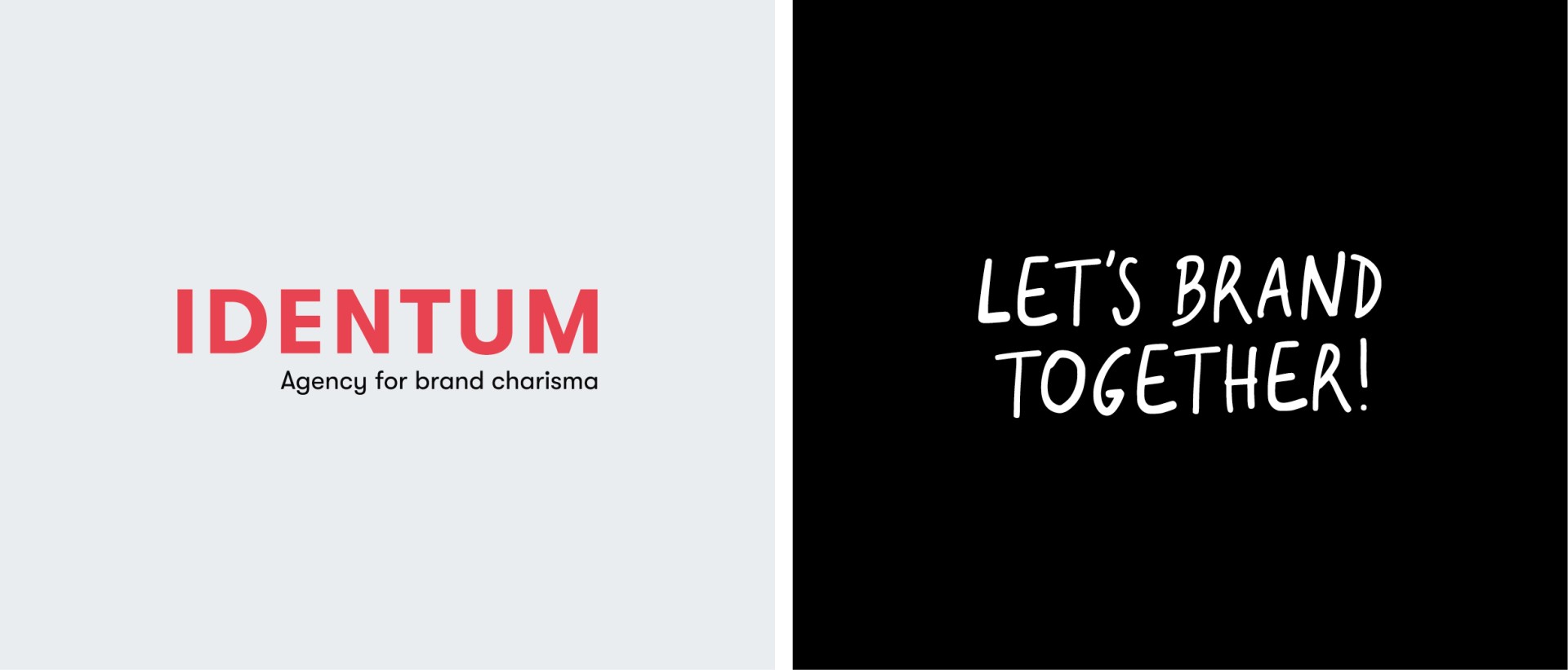
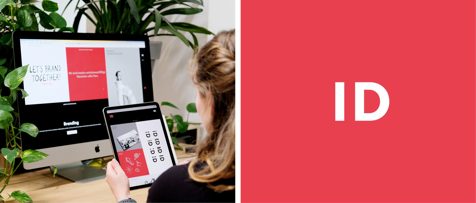
Logo? Spot on. Colour? Pure bliss.
Following the initial processes that involved the whole graphics team, it became clear that both logo and colour would need to be refreshed. Without losing recognitional value of the legacy logo, the new signet clearly stands for itself, the lettering now a slight adaptation of its predecessor with a stronger style that reflects confidence and gravitas. The new company abbreviation "ID" holds the actual brand identity and stands for identification - the essence of the team and the fusion of the Identum brand.
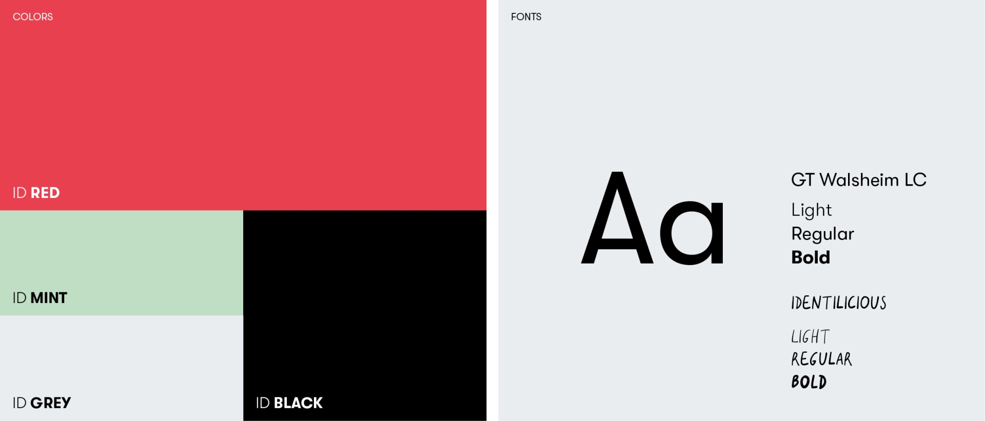
We are happy to report that the entire team has now finally said their goodbyes to former slightly conservative associations, in terms of the colour scheme and is looking towards a more creative, and bold appearance with a strong red and black as well as white and grey. Furthermore, there are now mint green accents providing a pleasant balance within the adapted colour palette.
Playful illustrations
But we still had to ask: What makes us unique? A philosophical question that kicked off some rather playful handwritten elements which then became an important part of the new Identum design. On the one hand they manage to break up geometric-graphic forms but also represent a contrast to everything digital and can even be viewed as a sign of the individual: The uniqueness of the handwriting – because nobody writes like us, nobody writes our stories. At Identum, the individuality of every single one of us is finally visualised to embrace a new together - a superband woven out of a sworn unit that is Identum.
This is also depicted by cheerful emoticons that tumble out of the ID shortcut in various digital animations, primarily used in social media. While they loosen up the design and suggest creative-flexible thinking, they also represent the many facets of the agency and the many personalities - each and every one a bright star in the Identum universe.