Warning message
The PHP filter has been deprecated. Please use the "Limit allowed HTML tags" filter instead.
Brands with charisma think about the future
Brand development and screendesign
e-vo eMobility is the bundling of seven energy suppliers who have jointly set themselves the goal of sustainably establishing e-mobility in Austria. Through the further development of IT systems for the operation of charging infrastructure, the charging network for electric vehicles is to be made more efficient, stable and secure. The necessary services and systems for e-vehicles will thus be made suitable for mass use and are thus an essential factor for the success of e-mobility. Such an important project needs a strong presence, which we were able to provide.
Systems that make a big difference
The effects of climate change present us as a society with different challenges. They are the reason for a massive energy turnaround, which also strongly affects mobility. Slowly but surely, we are moving away from environmentally harmful combustion engines towards more environmentally friendly electric mobility. In order to be able to achieve the climate protection goals by 2030, one third of vehicles must be electrically powered. The prerequisite for this is not only the availability of e-cars, but also an efficient and stable charging management system. E-vo eMobility is making a significant contribution to achieving this goal by establishing charging systems that are stable and inexpensive to operate.
Clear positioning in the competition
We support e-vo eMobility in its brand development as well as in its positioning as a new brand in the competitive environment.
In a joint process with the e-vo management team, we developed the long-term relevant cornerstones of the brand. A clear common mission statement, a simple understandable category as well as the brand's fundamentals in terms of values, character and promise as well as design were thought through, formulated and jointly decided in this process. We have summarised this long-term basis in a comprehensive brand booklet in a comprehensible and future-oriented way.

A design that makes sustainability visible
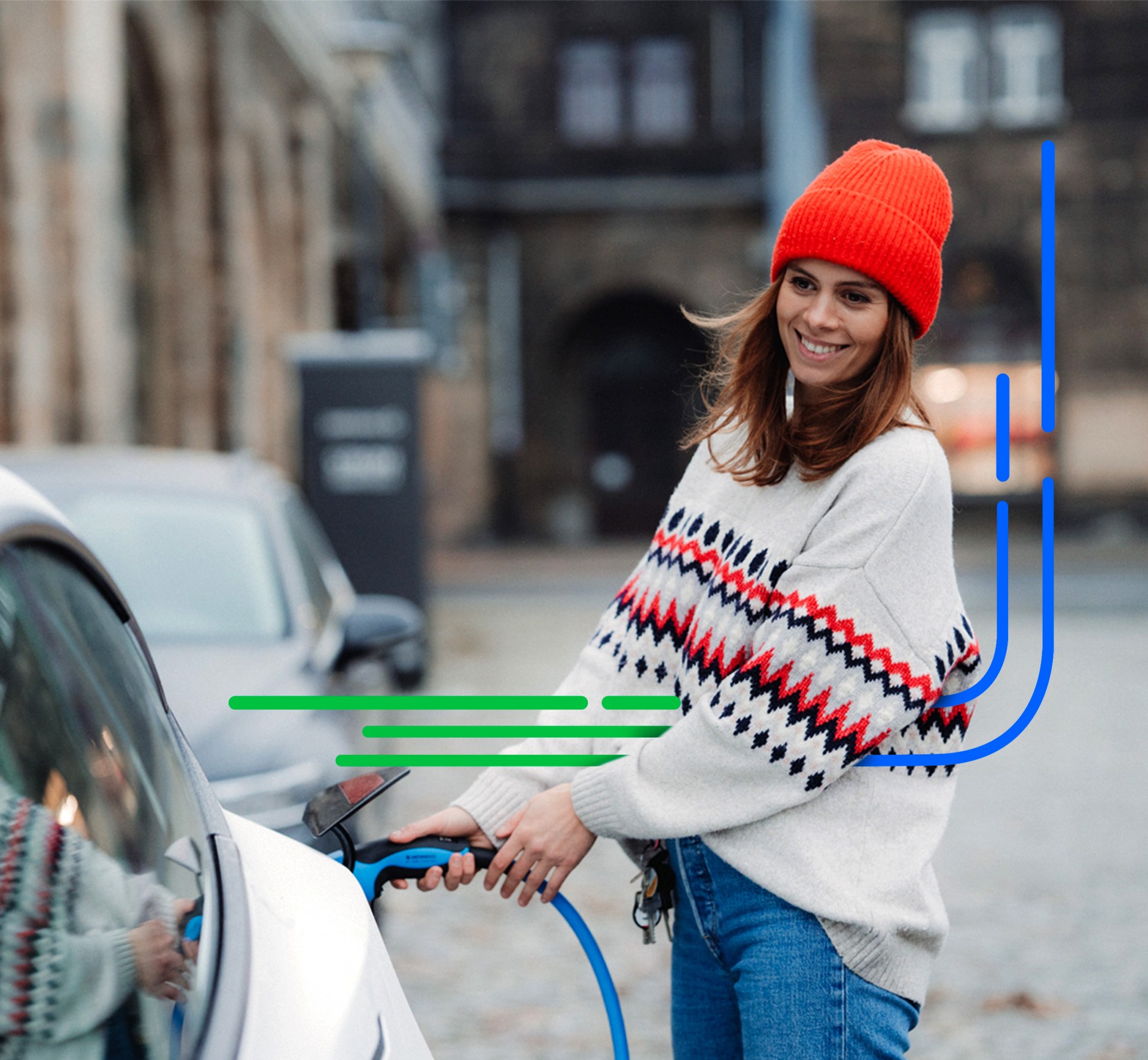
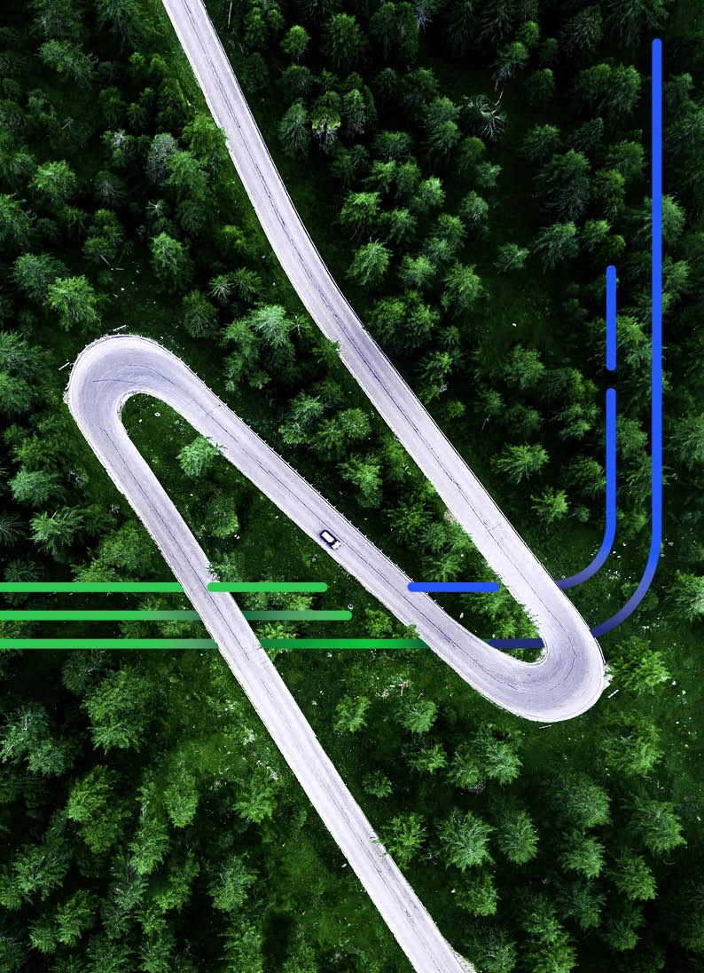
To make the corporate values of the newly founded company recognisable, we came up with a suitable design that reflects e-vo's strong focus on sustainability, which we defined in a CD manual. For the design of the web and printed matter, we developed the stylistic element, the "Lines of Energy", which run through the design. They symbolise innovation and networking and point the way to intelligent energy solutions and functioning infrastructure. The logo and icons impress with green colour accents, which stand for sustainable energy production. Finally, a comprehensive CD manual provides an overview of the developed design elements and their use.

A screen design to be recognised
Finally, the developed design should also ensure the necessary recognition value of the e-vo eMobility brand for visitors to the website. This requirement is reflected in the reuse of the CD colours and the CD elements that were also used there. Fresh colours provide the necessary highlights and direct the focus to where it is desired.
Furthermore, micro-animations and animations were used to enable movement in hover effects through user interactions and icons.


