
Warning message
The PHP filter has been deprecated. Please use the "Limit allowed HTML tags" filter instead.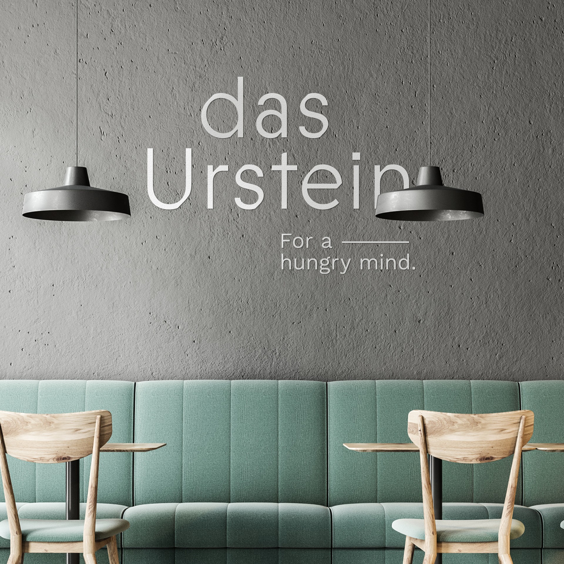
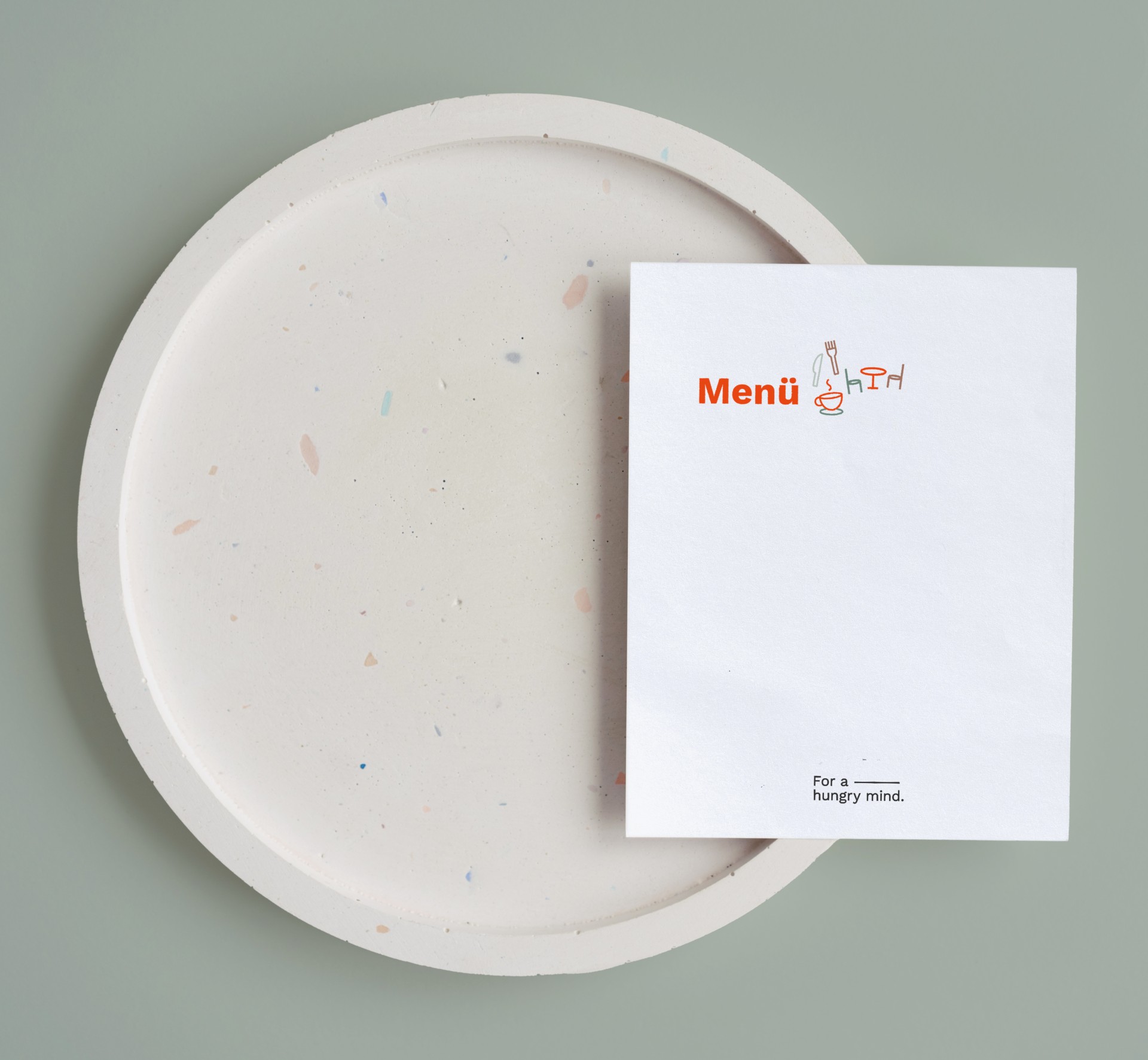
Das Urstein — For a hungry mind
Branding
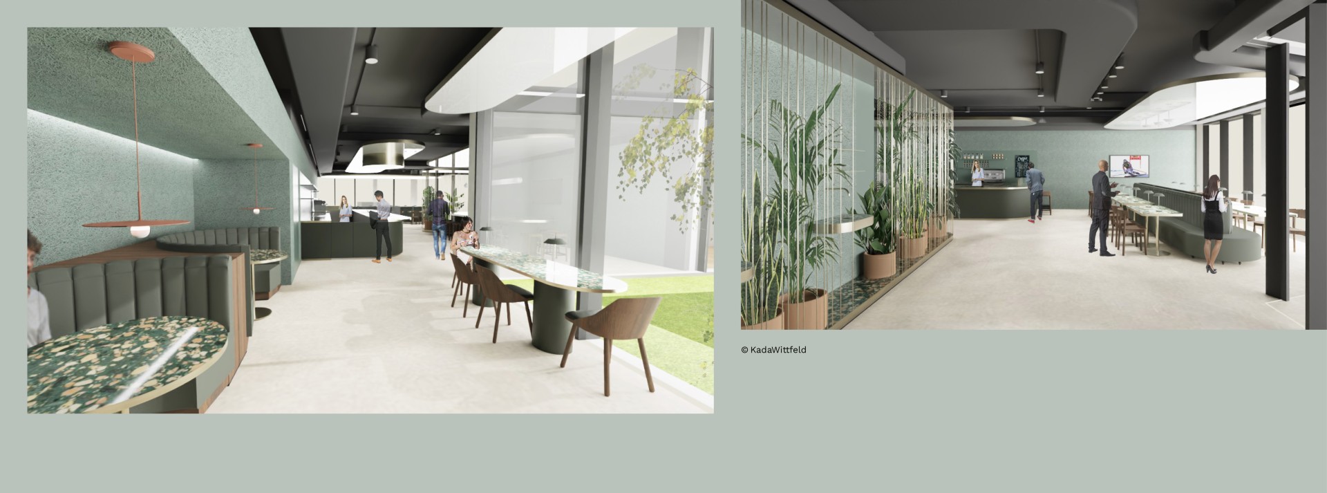
A new bistro emerged at Wissenspark Urstein, offering fresh and regional cuisine to the brilliant and curious minds working there. Identum has crafted a modern yet gentle brand design for it.
Bistro for curious minds
At its core, das Urstein combines serenity and regionality, inspiring its visitors with an elegantly minimalist ambiance. With employees from IT and event companies, as well as students as the primary target group, the branding concept and the slogan "For a hungry mind" were intuitively and effectively developed through a clearly defined process. This has resulted in the most desirable outcome for any agency: satisfied customers.
The slogan now emphasizes an active mindset with a passion for knowledge – Das Urstein offers the ideal menu to satiate these hungry minds at Wissenspark. With this cosmopolitan slogan, we simultaneously distance ourselves from outdated associations and focus on the individuals on campus who dedicate themselves to their ambitious work every day.
Healthy food and smart people
Our task – aligning the brand design and language with the exceptional gastronomic environment – was approached with a refreshing perspective throughout the creative process, aiming to capture the emotions inspired by the nearby Salzach River's natural beauty. Consequently, we also mirror the essence of Wissenspark itself: curiosity, creativity, and knowledge.
The final design, alongside the essential design language and tone, can effortlessly adapt to different formats. In doing so, we establish an authentic and coherent identity – pleasing hungry minds.
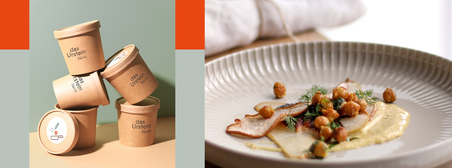
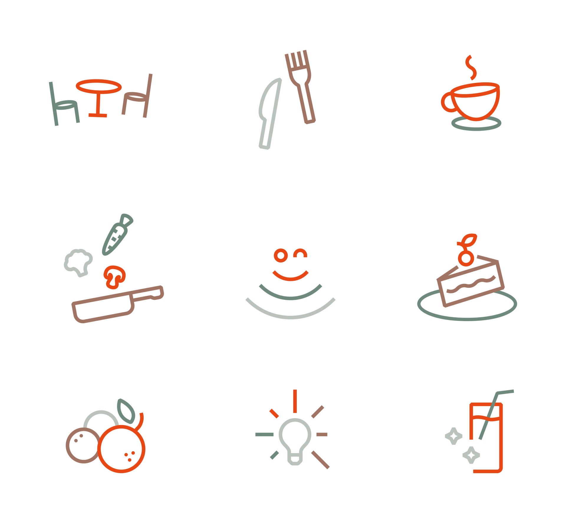
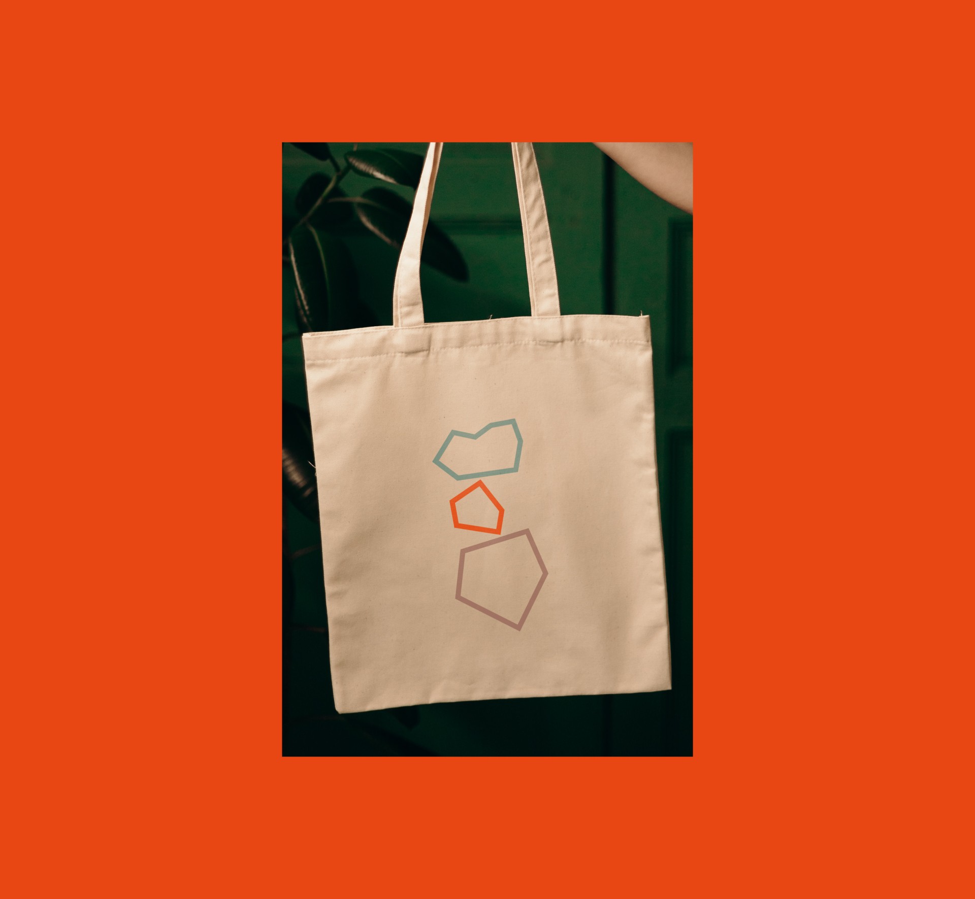
Brand design in biophilic colours
The regional high-quality cuisine is reflected in the design, providing delightful moments that brighten everyday life. Complementing this is the biophilic color palette, which seamlessly blends modernity with lightness and warmth. The colours of the new corporate identity mimic nature – soft, earthy, and textured – harmonizing with the overall aesthetic.
In this context, "Tangerine Red" creates inviting comfort zones, and in the branding, stones serve as style elements, mirroring the wonderfully contrasting interplay of lightness and equilibrium. The slight irregularities in the typeface emulate stones shaped by the river, creating an urban coziness that encapsulates the bistro's philosophy.